|
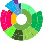
Silly InfovizColorful fun information visualizations that may or may not be based on real data or help you better understand. |
#data
|
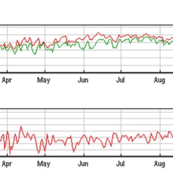
Have the Seasons Really Changed?As a small child I remember the weather in Illinois being quite different. Everyone I know talks about global warming as an accepted reality and something that’s bigger than our individual anecdotal experiences of climate but I can’t help get over being hung up on my personal relationship to the weather, it feels more meaningful than charts and graphs. I decided to see how my memory matches up with data. |
|
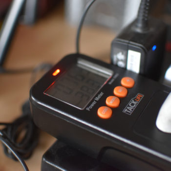
Power Testing!Every power adapter is rated in volts and amps but that doesn’t really convey how much electricity it really uses. Is that monitor really 1.5A? Is it a terrible power suck to leave your phone charger in all of the time? |
|
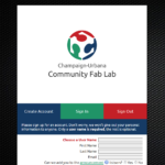
Fab Lab Sign In InterfaceI got to build the entire sign-in system for our Fab Lab! I’m told the cool kiddos call that “Full Stack Developer” these days. |
|
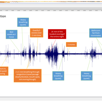
Sleep AnalysisI wanted to see how peacefully I sleep when I’m sick and my partner was complaining about snoring so I decided to collect some data! |
|
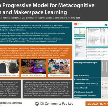
Academic Posters |
|
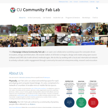
WebsitesImprovements to the Fab Lab website over time. |
|
Infographics and Digital ArtInfographics and digital art created over the years. |
|
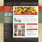
Collaborative Image Annotation Tool for GISIn 2009 the Graduate School of Library and Information Science sent a team of community informatics researchers to São Tomé to digtize maps and help the local government establish a Geographic Information Systems, with the intention of putting it to use for applications related to governance and population studies. As part of this process teams located at UIUC and on the island had to communicate with one another to translate, evaluate and annotate map resources. I built a tool based on Omeka, an open source archival web app, that would aid researchers in these tasks. It also had potential for applications in medical image review or graphic asset analysis. |
